Mele E Pere Apparel Branding
“Mele e Pere” is an Italian expression that directly translates to “Apples and Pears” in English.
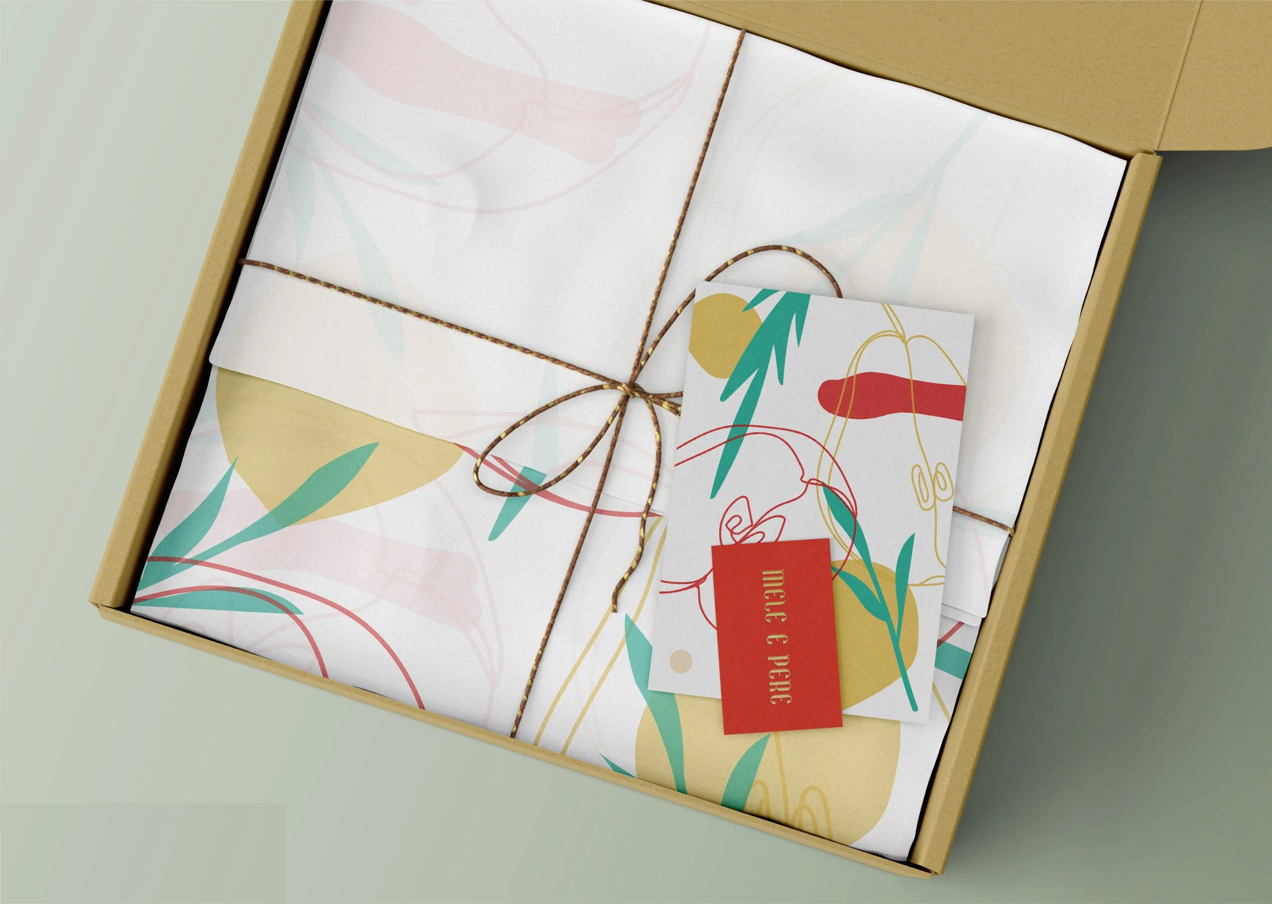
Mele e Pere brand is aimed at young women in their 20s who are fashion-savvy. The brand’s visual identity is centered around the lively, youthful symbolism of apples and pears, expressed through a fresh and light color palette.
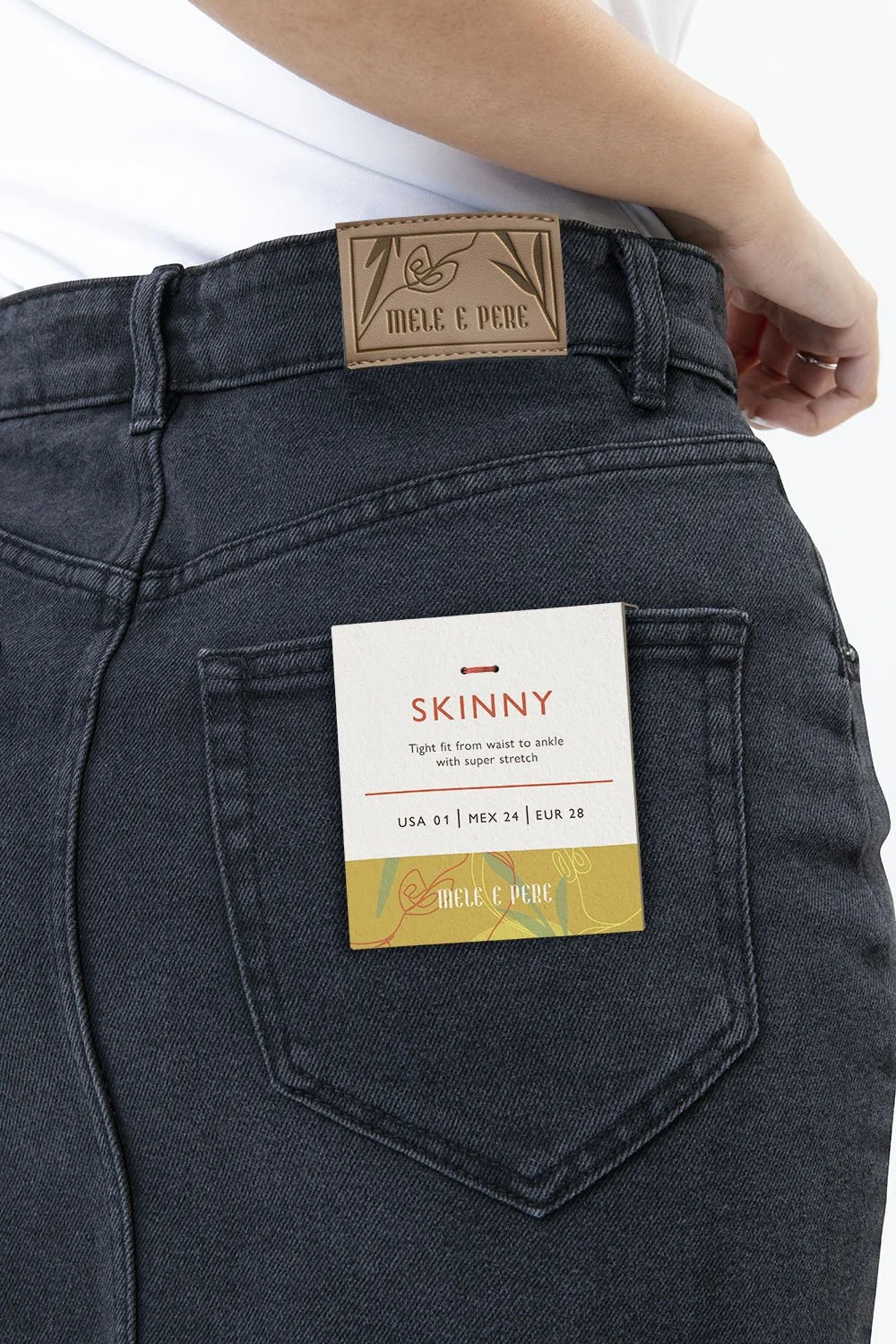
Logo Concept.The logo design for Mele e Pere features a playful and antique typography of the brand name, reflecting the brand’s focus on youthful and stylish fashion for young women.
The logo also includes two color variations of mandarine red and limelight. These colors represent the colors of apples and pears, the two key images that form the core of the brand’s visual identity. The use of these colors adds a playful and unique touch to the logo design, while also reinforcing the brand’s connection to nature and its commitment to sustainability.


